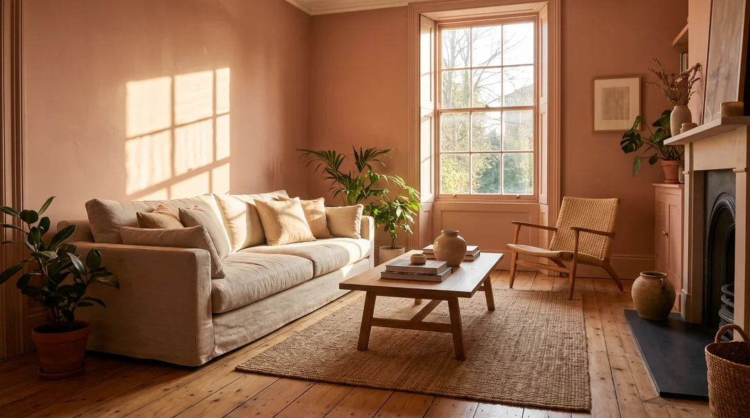
Everyone has been there: the colour looked perfect on the little card at the store, and once it is on the wall it is grey, or too yellow, or it changes completely between morning and evening. Nothing is wrong with the paint. The light in the room made the decision for you.
Choosing a paint colour starts with understanding the light it is going to get.
The room's orientation changes everything
In Quebec, as everywhere in the northern hemisphere, the direction your windows face sets the quality of the light, and therefore how a colour reads.
North-facing room. Indirect light, steady all day, but cool and slightly bluish. Colours look greyer and darker than in the store. This is the room where a cool grey turns gloomy. Lean toward warm undertones: creamy off-whites, pinkish beiges, olive-leaning greens, soft terracotta.
South-facing room. Abundant, warm light that shifts a lot through the day. Colours look brighter and lighter. This room handles cool tones best (blues, blue-greys, fresh greens), and bold colours that would die elsewhere hold up here.
East-facing room. Warm and bright in the morning, cooler and flatter in the afternoon. Think about when you use it: an east bedroom is mostly seen on waking, an east kitchen mostly in the evening.
West-facing room. Fairly neutral in the morning, then very warm, almost golden, late in the day. Colours that are already warm can turn orange around 5 p.m.; a slightly cooler undertone balances that.
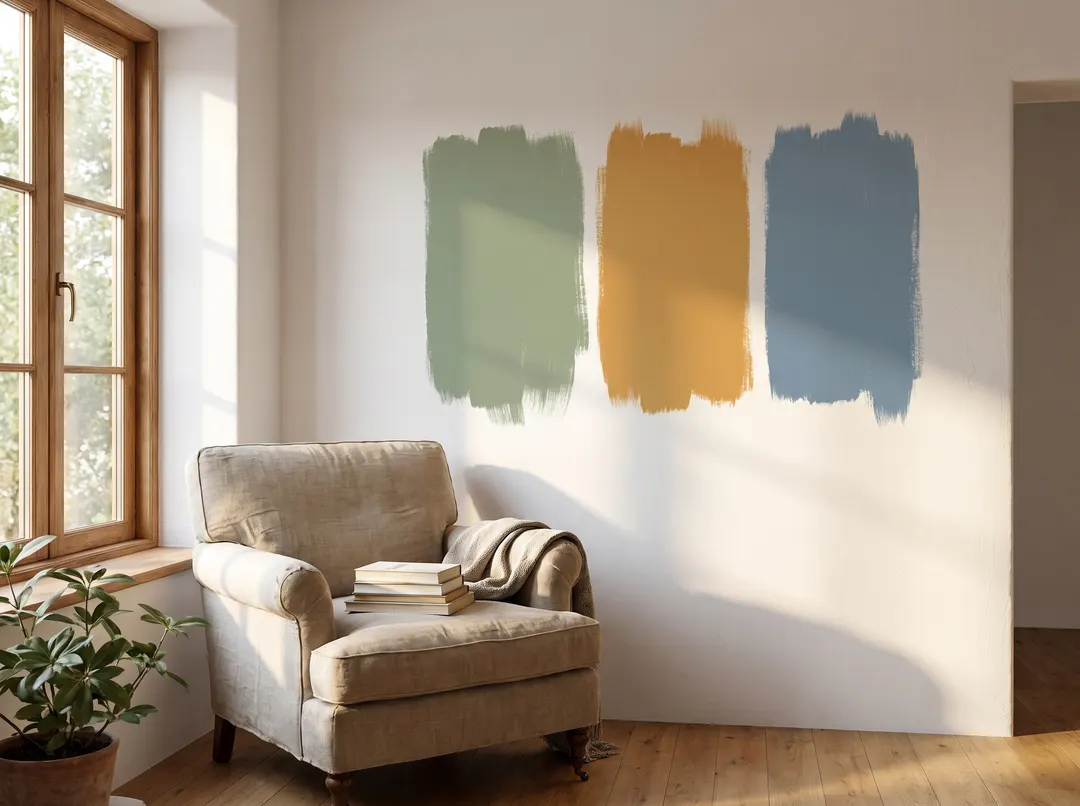
The Quebec winter, a factor not to forget
A colour picked in July, with a high sun and sixteen-hour days, does not behave the same way in January. The winter sun is low, days are short, and the light coming in is often filtered through grey sky.
That is especially true of north-facing rooms and basements, which get noticeably darker from November to March. If you paint in summer, choose a shade for those rooms slightly lighter and warmer than the one that looks ideal that day.
Undertone: what hides inside a colour
Two beiges that look identical on a card can have very different undertones: one leans pink, the other green or yellow. Under cool north light, that undertone comes forward and can surprise you.
To spot it, set the sample next to a sheet of pure white paper. The undertone shows by contrast. And compare it with what will not change in the room: the floor, the cabinets, the countertop. An orangey oak floor and a grey with a violet undertone will fight.
Light reflectance value
On the back of most colour cards, a number between 0 and 100 shows how much light the shade reflects. It is usually labelled LRV.
- Above 60: light colours that open up and brighten a dark room
- Between 30 and 60: mid tones that add character without darkening
- Below 30: deep colours that envelop and make a room feel smaller and more intimate
In a north-facing room or a basement, aiming high makes a real difference. In a south-facing room already flooded with light, a deep colour becomes a perfectly realistic option.
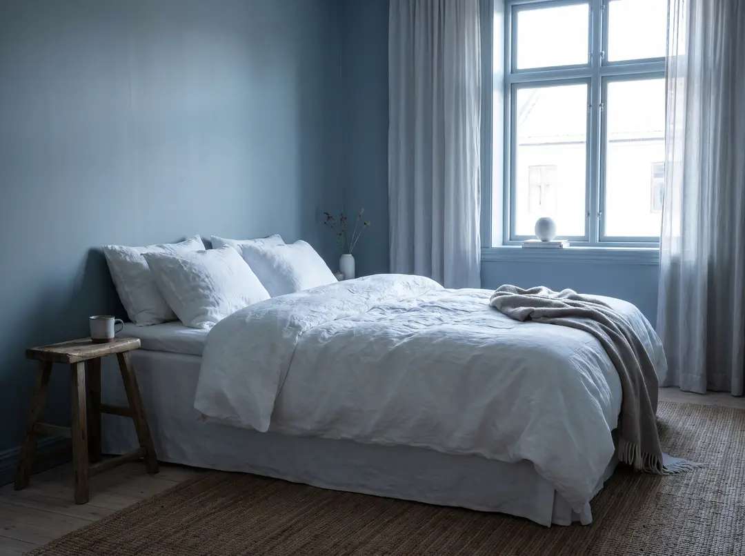
The only method that works: test big
A five-centimetre card tells you almost nothing. The reliable method:
- Buy a sample size of two or three finalists.
- Paint squares at least 60 cm on a side, or paint a large sheet of cardboard you can move around.
- Put them on several walls, including the one that gets the least light.
- Look at them morning, noon and evening, and under artificial light. The colour temperature of your bulbs changes the shade too; our article on kitchen lighting explains why.
- Wait at least two days before deciding. The first crush is not always the right one.
Sheen matters too
The same pigment reads differently depending on the finish. A matte finish absorbs light, hides wall flaws and gives a deeper colour, but washes less well. An eggshell or satin finish reflects a little more, stands up better to cleaning and suits hallways, kitchens and bathrooms. The glossier the finish, the lighter the colour looks and the more every wall flaw shows.
For preparation and application, our guide to how you paint an interior wall covers the steps. And if you are looking for colour ideas, our article on interior design trends offers several.
An experienced painter has seen the same shade in dozens of different rooms and can tell you how it will look in yours. In the metropolitan area, our list of painters in Montreal is a starting point.
Frequently Asked Questions
What colour works in a north-facing room?
Shades with warm undertones: creamy whites, pinkish beiges, olive greens, soft terracotta. North light is cool and makes cool greys look gloomier. A colour a little lighter than planned also offsets the lack of light, especially in winter.
Why does the colour look different on the wall than in the store?
Because the light is different. The store is lit evenly and often coolly, while your room gets natural light that depends on its orientation and the time of day. The larger surface also intensifies the colour.
How big should a paint sample be?
At least 60 cm on a side. A small chip does not let you judge how a colour behaves across a whole wall. Ideally, paint a board you can move from wall to wall and check at different times of day.
Does a dark colour make a room look smaller?
It makes it feel more intimate, yes, especially if the room lacks light. In a well-lit south-facing room, though, a deep colour can add a lot of character without crowding the space.
Should the ceiling be the same colour?
Not necessarily. A white ceiling or a heavily diluted version of the wall colour keeps the room bright. Painting the ceiling the same shade creates an enveloping effect that works well in a tall room or a bedroom.
Post your project
Describe your work once, and contractors in your area who do this kind of work can get back to you. It's free, with no commitment.
Post a project