For years, the ideal bathroom was white, grey or beige, on the theory that it was safer for resale. That reflex is changing. Dusty pink, forest green, ochre and deep blue are back, and they turn the most functional room in the house into one of the most enjoyable.
Daring to use colour does not mean taking a blind risk. You just need to know where to put it, and how easy it will be to change.
Start with what will not move
The first question is not "which colour" but "on what". In a bathroom, surfaces do not have the same lifespan:
- Paint gets redone in a weekend, for a few hundred dollars.
- Wall tile stays fifteen or twenty years.
- Floor and shower tile too, and it is expensive to replace.
- A coloured tub, toilet or sink, very trendy, rarely gets swapped.
Hence a simple rule: the more permanent the surface, the more the colour has to be one you will still love in fifteen years. If you have a crush on a bold shade but doubt it will last, put it on the painted walls and keep the tile softer. If you are sure, coloured tile delivers a result paint never reaches.
Three ways to be bold, from cautious to all-in
Colour in paint, neutral tile. The ideal starting point. An ochre, sage or navy wall above white or cream tile completely changes the mood, and gets repainted the day you want something else. Use paint made for humid rooms, in an eggshell or satin finish, which stands up better to moisture and mildew.
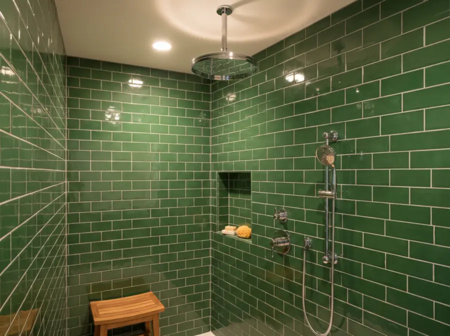
One coloured element. A whole shower in green tile, a terracotta tile floor, a deep blue vanity: one strong element, the rest calm. It is often the most elegant approach, because the colour looks like a decision rather than an accident.
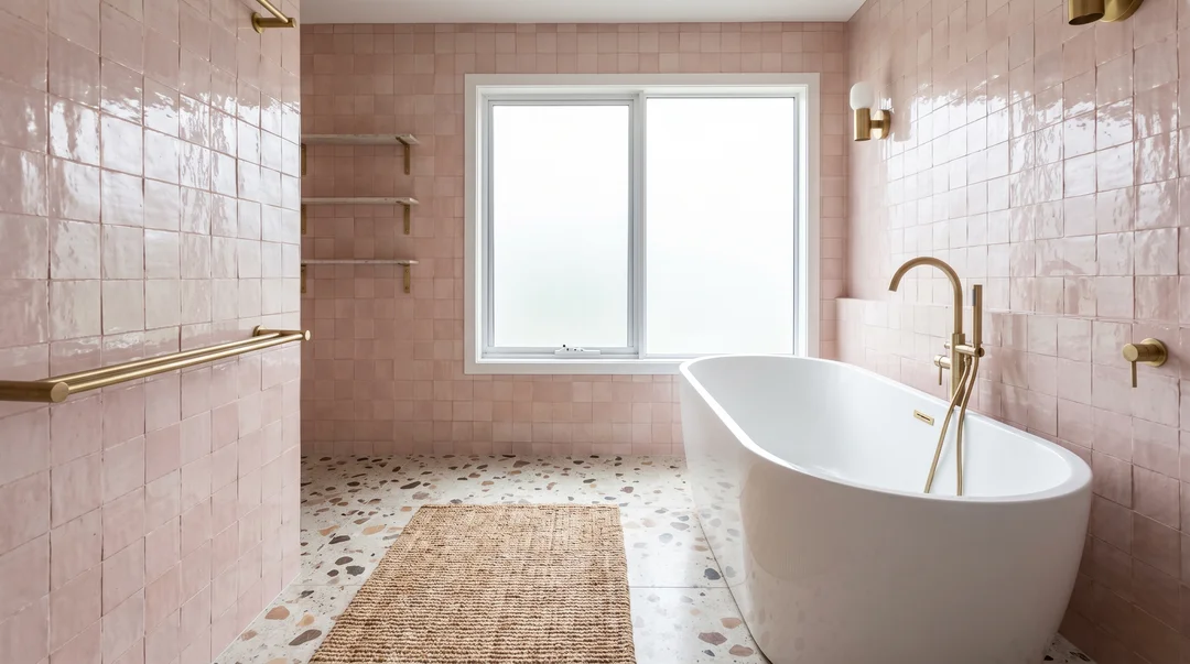
The enveloping room. Walls, tile, sometimes the ceiling, all in one colour family, like a bathroom entirely in dusty pink or green. It is the most dramatic approach. It works best with a slightly muted tone rather than a saturated colour, and with variations in texture: glossy zellige, matte floor, velvety paint.
The powder room: the perfect place to try
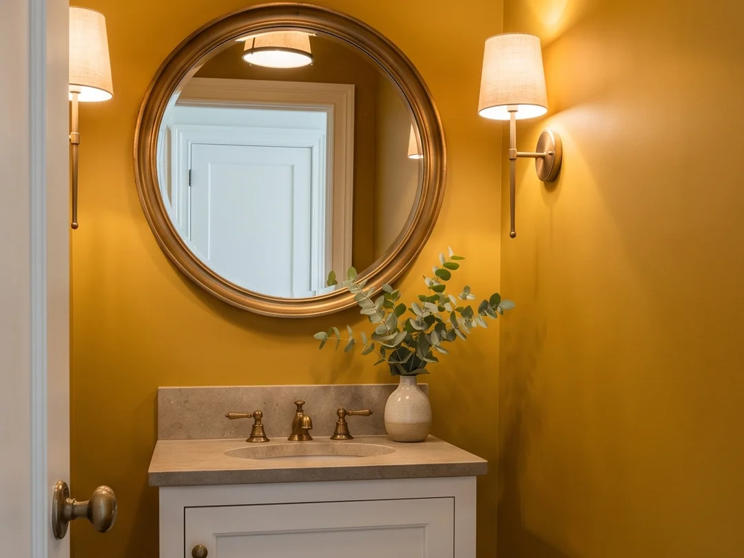
The small main-floor powder room, with just a toilet and a sink, is the ideal room to be bold. You spend little time there, it often has no window and, against all expectations, deep colours work especially well in it. A small dark room painted a deep ochre or green becomes a jewel box rather than a closet.
It is also where the risk is lowest: a powder room gets repainted in an afternoon.
Colours that work well in a bathroom
Greens, from sage to forest. They evoke nature, pair beautifully with wood and brass, and feel calm.
Dusty pinks and terracotta. Warmer than people expect, very flattering to skin in the mirror, lovely with brushed brass and terrazzo.
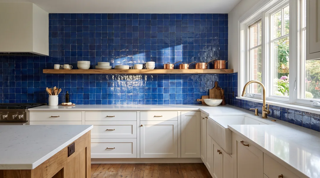
Deep blues. Classic without being cold, especially in a well-lit room.
Ochres and mustard yellows. Bright, warm, excellent in a windowless room lit with warm light.
One caution: bathroom light is often artificial, and its colour temperature completely changes a colour. A green chosen under cool light goes flat under warm bulbs, and vice versa. Our article on choosing a paint colour by the light explains how to test before deciding.
Coordinating colour, metals and grout
A colourful bathroom succeeds in the details.
- Metals. Brass warms greens, pinks and blues; chrome and brushed nickel cool and modernize; matte black adds graphic contrast. Our article on faucets and hardware covers the strengths and pitfalls of each.
- Grout. On coloured tile, matching grout gives a rich, uniform surface; white grout outlines each tile for a more graphic, retro feel. Our article on bathroom tile goes back over that choice.
- Supporting neutrals. A strong colour breathes better next to a warm off-white, natural wood or beige stone than next to a very cold pure white.
What about resale?
It is the argument you always hear. It deserves an honest answer.
A strong colour on a permanent surface can indeed put off some buyers, especially if it is very dated or very personal. But a well-executed colourful bathroom, with quality materials and a coherent palette, stands out from the hundreds of grey bathrooms a buyer walks through. What really hurts resale is wear and sloppy finishing, far more than colour.
If you plan to sell in the next two or three years, keep the boldness in the paint. If you are staying a long time, make the bathroom you want to see every morning.
Coloured tile installs like any other, but it is less forgiving of a crooked joint: trust it to an experienced tiler. For the walls, a painter can recommend the right paint for the room's humidity.
Frequently Asked Questions
Does a colourful bathroom hurt resale?
A very personal colour on a permanent surface can hold some buyers back. A well-executed colourful bathroom with a coherent palette tends to stand out in a good way. If you are selling soon, put the colour in the paint, which is easy to change.
What paint should you use in a bathroom?
Paint made for humid rooms, in an eggshell, satin or semi-gloss finish, which resists moisture, mildew and cleaning better. Good ventilation is still essential for it to last.
Do dark colours work in a small bathroom?
Yes, especially in a windowless powder room. A deep colour creates an enveloping mood rather than a closet effect. Plan good lighting, ideally warm, to show it off.
Should colour go in the tile or the paint?
It depends on how sure you are. Paint changes easily and suits a bold shade you have doubts about. Coloured tile gives a richer result but stays fifteen or twenty years: choose it for a colour you will love for a long time.
Which metals go with a colourful bathroom?
Brass warms greens, pinks and blues. Chrome and brushed nickel give a fresher, more modern feel. Matte black creates graphic contrast. The key is keeping to two finishes at most in the room.
Post your project
Describe your work once, and contractors in your area who do this kind of work can get back to you. It's free, with no commitment.
Post a project